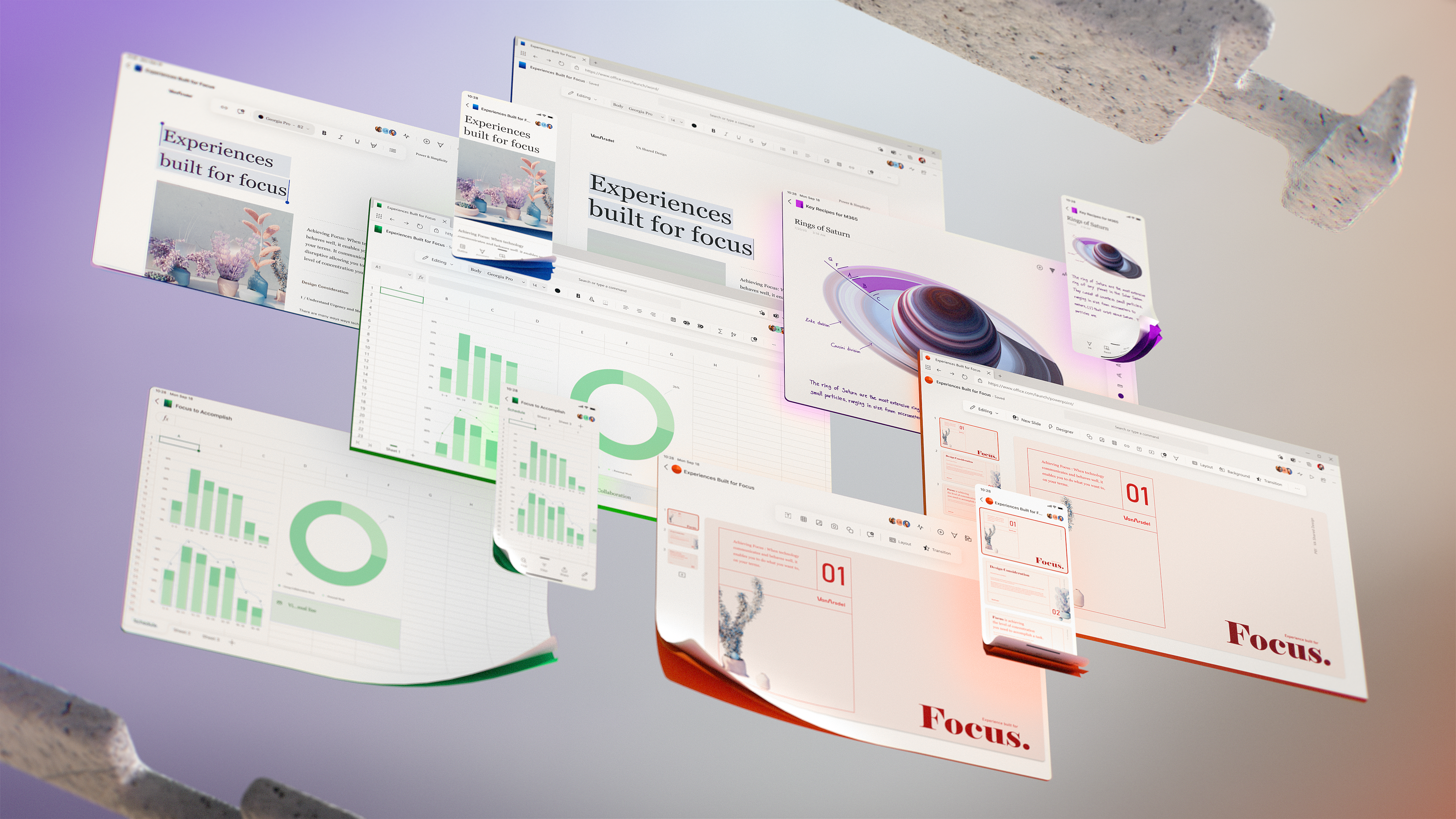
Microsoft teases its future of Office UI and design today, and it involves some big changes to the traditional ribbon interface. The software giant has been gradually improving Office with its Fluent Design system over the past couple of years — new royalty-free images, adding new icons, a dark mode, and overhauling the ribbon toolbar by making it smaller and easier to use. The next stage of Microsoft’s Office design sees the company focus even further on simplicity.
Jon Friedman views
“The next wave of Microsoft 365 UX changes will go even further by fading brand colors from app headers and exploring adaptive commanding,” explains Jon Friedman, corporate vice president of design and research at Microsoft. “This lets you move a simplified toolbar around the screen to wherever you find it most helpful, using progressive disclosure to contextually reveal commands.”

New Office’s ribbon
This adaptive commanding will see Office’s ribbon interface replaced with a toolbar that can be undocked to float nearby actions you’re taking in documents with contextual commands. Microsoft is currently exploring how this interface will work, but some of the design details the company is teasing today will roll out within a year or two, according to Friedman.
“Since its inception, the ribbon has been a signature experience bringing user intent and commanding together. It originated on the desktop, but as the world and people’s lives are entirely cross-platform and multi-device, we’re re-imagining what intent and context-aware commanding looks like in the future,” says Friedman in a statement. “Having your ribbon commands follow your actions and being context aware will reduce cognitive load and increase focus on the task at hand, whether you’re on your phone in the subway or your tablet on the sofa or your desktop.”
Why ribbons?
Microsoft originally introduced its ribbon interface into Office 2007, and the company is now ready to move beyond it. Microsoft has been gradually simplifying the ribbon across mobile and the web, but the new designs shared today are certainly a big step beyond the ribbon. Microsoft’s simplified Office interface puts a lot more focus on the actual content you’re creating, rather than the chrome.
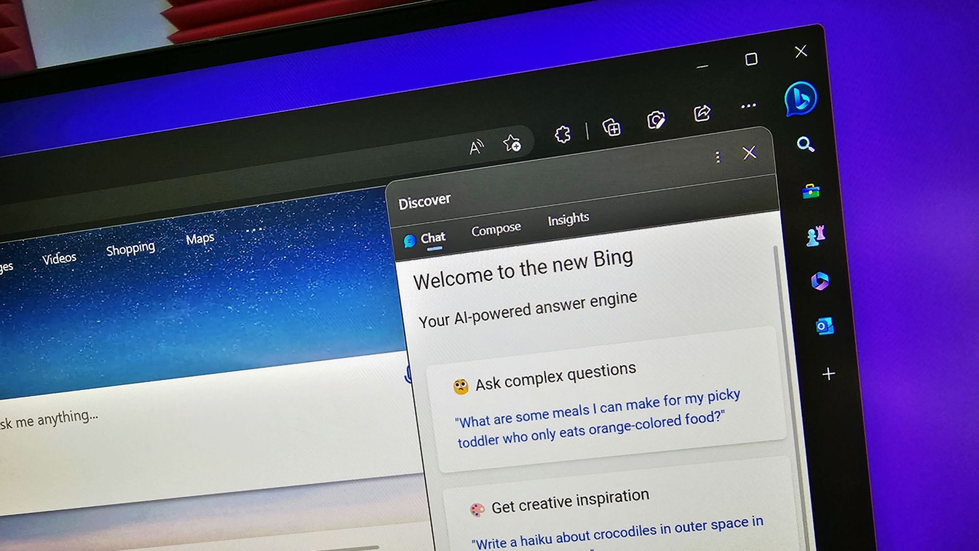
Other changes include a simple app icon at the top of apps to indicate which Office app you’re using, and the centralized search or command bar taking the center stage. Microsoft has been emphasizing this search and command bar interface in Office in recent years, and it’s a feature that also exists in Microsoft Teams.

“We’ll be further advancing our seamless, cross-suite Search to bring relevant information right to your fingertips,” says Friedman. The goal of all of these changes is the idea of driving productivity gains by reducing unnecessary distractions and focusing attention on tasks. “Throughout, we’re grounding everything we build in deep research into the nuances of attention,” explains Friedman. “Some moments call for lengthy, sustained concentration. Others, such as many mobile scenarios, are optimal for micro-tasking. By designing for multiple cognitive states, focused experiences throughout the Microsoft 365 ecosystem minimize external distractions, lessen self-interruptions, and jumpstart flow.”
It’s not clear exactly when these changes will arrive in Office apps, the web, and elsewhere in Microsoft 365. “While some of these changes will roll out within a year or two, others are still very much exploratory,” says Friedman. Microsoft is also “conducting global studies” to better understand how work needs are changing during this pandemic, and to help the company design its software accordingly.


One thought on “Microsoft teases its future Office UI”