In this new post, I continue to add more features and in particular new view components in AdminLTE project built with ASP.NET Core. Here, the previous posts:
- Integrated AdminLTE in a ASP.NET Core project
- Features for AdminLTE with ASP.NET Core
- Integration with Identity in AdminLTE project
- External Providers In AdminLTE Project
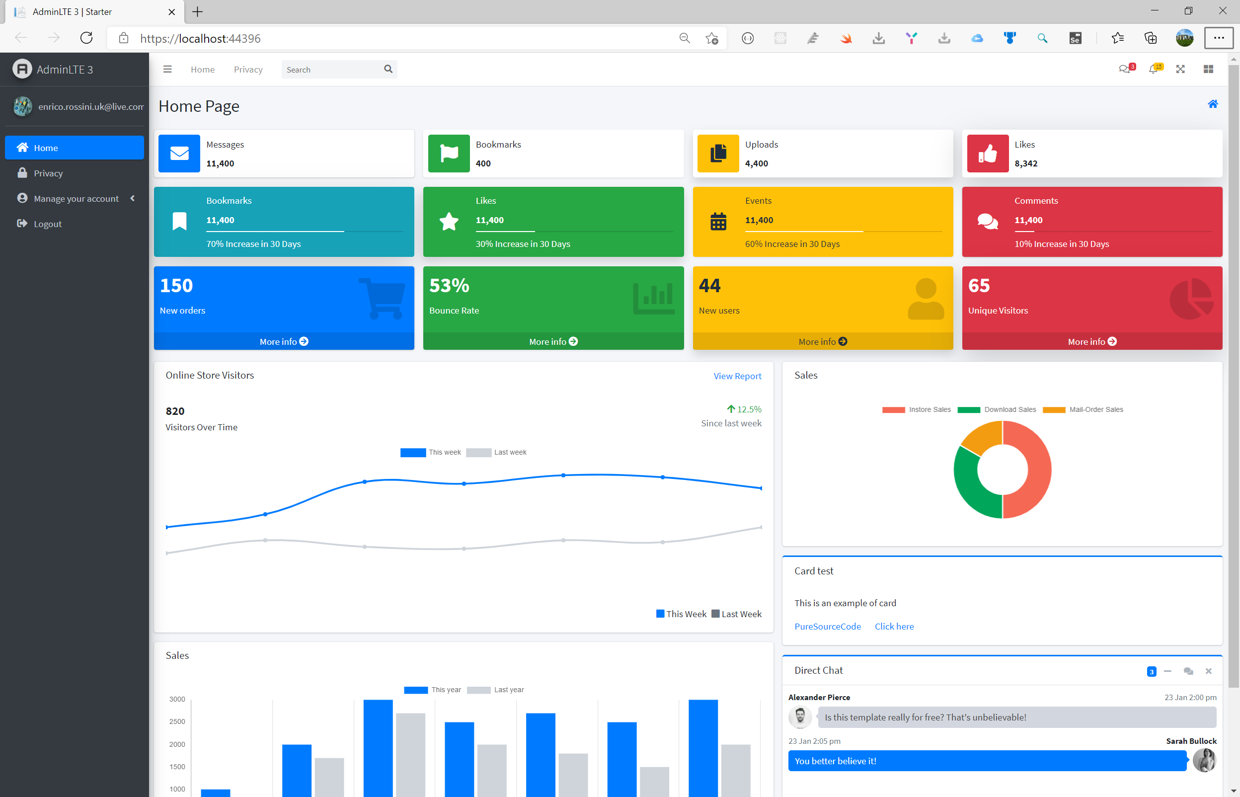
So, I’m going to explain how to implement in the project only one component. However, the full source code you find on GitHub has plenty of new view components that you can use. The result of this implementation is visible on the above image.
View Components
First, my idea of view component is a small portion of the page based on a specific model. In one of my previous post, I explained how to implement a view component from scratch for in a ASP.NET Core project.
So, the view components I have implemented yet are:
- Boxes
- info-box
- progress-box
- show-box
- Charts with Chart.js
- bar-chart
- line-chart
- pie-chart
- Card (simple)
Now, the implementation of all the view components are exactly the same, for now. First, I’ll create an empty view. Second, create a ViewComponent class derived from ViewComponent. Third, create a model for the component.
Implementation
Before we create our custom view component or its associated view file please note that the runtime searches for the view in the following paths:
- /Views/{Controller Name}/Components/{View Component Name}/{View Name}
- /Views/Shared/Components/{View Component Name}/{View Name}
- /Pages/Shared/Components/{View Component Name}/{View Name}
Off course, just like everything else in ASP.NET Core, we can customize the view search path and guide the runtime to look for the views somewhere else but for simplicity I have decided to use one of the default view path.
So, I’m going to show how to create a new ProgressBoxViewComponent. Under the Shared folder, I’m creating a new folder called Components and then another folder called ProgressBox.
Model
So, we want to organize our code and project solution. For this reason, I’m going to create under the Models folder, a new folder called Components. For the boxes, I’m creating a new folder called Boxes.
First, I’m going to create the common class called BoxModel
using AdminLTEWithASPNETCore.Enums.Components;
using AdminLTEWithASPNETCore.Extensions;
using System;
using System.Collections.Generic;
using System.ComponentModel.DataAnnotations;
using System.Linq;
using System.Reflection;
using System.Threading.Tasks;

namespace AdminLTEWithASPNETCore.Models.Components.Boxes
{
    public class BoxModel
    {
        public string BackgroundColor { get; set; } = "bg-blue";
        public string Icon { get; set; } = "fa-info";
        public string Text { get; set; }
        public ShadowType Shadow { get; set; } = ShadowType.None;
        public string SubText { get; set; }

        public string ShadowText => Shadow.GetDescription();
    }
}
The code in BoxModel is a generic one for all the other box’s models. The model is the way we pass values from the controller to a view. In the following image the explanation of the property and how to use them in the UI.

So, the shadow is common to more than one component in the UI. For this reason, I decided to have a enum for it. I’m going to create a new folder enums and then components. The ShadowType is the following:
using System;
using System.Collections.Generic;
using System.ComponentModel;
using System.Linq;
using System.Threading.Tasks;

namespace AdminLTEWithASPNETCore.Enums.Components
{
    public enum ShadowType
    {
        /// <summary>
        /// The none
        /// </summary>
        [Description("")]
        None,
        /// <summary>
        /// The small
        /// </summary>
        [Description("shadow-sm")]
        Small,
        /// <summary>
        /// The regular
        /// </summary>
        [Description("shadow")]
        Regular,
        /// <summary>
        /// The large
        /// </summary>
        [Description("shadow-lg")]
        Large
    }
}
Based on that, what we have to add in the css class in a component to have the shadow, is one of the values in the Description. For reading the description, I’m going to create an extension for enum.
using System;
using System.Collections.Generic;
using System.ComponentModel;
using System.Linq;
using System.Threading.Tasks;

namespace AdminLTEWithASPNETCore.Extensions
{
    public static class EnumExtensions
    {
        public static string GetDescription<T>(this T enumerationValue) where T : struct
        {
            var type = enumerationValue.GetType();
            if (!type.IsEnum)
            {
                throw new ArgumentException($"{nameof(enumerationValue)} must be of Enum type",
                      nameof(enumerationValue));
            }
            var memberInfo = type.GetMember(enumerationValue.ToString());
            if (memberInfo.Length > 0)
            {
                var attrs = memberInfo[0].GetCustomAttributes(typeof(DescriptionAttribute), false);

                if (attrs.Length > 0)
                {
                    return ((DescriptionAttribute)attrs[0]).Description;
                }
            }
            return enumerationValue.ToString();
        }
    }
}
Now, the line Shadow.GetDescription() makes sense and it is not raising an error. This function reads the enum and try to read the Description annotation. If there is none, the value is empty.
Default view
Now, I want to add the view for the view component. After adding a new view, I copy from the AdminLTE template the HTML code for a progress box.
@model AdminLTEWithASPNETCore.Models.Components.Boxes.ProgressBoxModel

<div class="info-box @Model.BackgroundColor @Model.ShadowText">
    <span class="info-box-icon"><i class="fa @Model.Icon"></i></span>

    <div class="info-box-content">
        <span class="info-box-text">@Model.Text</span>
        <span class="info-box-number">@Model.SubText</span>

        <div class="progress">
            <div class="progress-bar" style="width: @Model.Percent%"></div>
        </div>
        <span class="progress-description">
            @Model.PercentDescription
        </span>
    </div>
</div>
Then, I replace or add the variables from the model and you have the result view in the above code.
View Component code
Last step to create a new View Components in AdminLTE project is to create the code for the view component. Add the class called ProgressBoxViewComponent.
using AdminLTEWithASPNETCore.Enums.Components;
using AdminLTEWithASPNETCore.Models.Components.Boxes;
using Microsoft.AspNetCore.Mvc;
using System;
using System.Collections.Generic;
using System.Linq;
using System.Threading.Tasks;

namespace AdminLTEWithASPNETCore.Views.Shared.Components.ProgressBox
{
    public class ProgressBoxViewComponent : ViewComponent
    {
        public async Task<IViewComponentResult> InvokeAsync(string title, string description,
            int percent, string percentDescription,
            string cssBackground, string fontawesomeIcon,
            ShadowType shadow)
        {
            ProgressBoxModel model = new ProgressBoxModel();
            model.BackgroundColor = cssBackground ?? null;
            model.Icon = fontawesomeIcon ?? null;
            model.Shadow = shadow;
            model.SubText = description ?? string.Empty;
            model.Text = title;
            model.Percent = percent;
            model.PercentDescription = percentDescription;

            return View("Default", model);
        }
    }
}
Add a new box in the UI
So, to use a view component as a Tag Helper, you need to register the assembly containing the view component using the @addTagHelper directive to the _ViewImports.cshtml file. For the purpose of this tutorial, I added following line in _ViewImports.cshtml file
@addTagHelper *, ViewComponentsDemoApp
So far our view component hasn’t provided us any special value as it is only rendering h1 element which we could easily render without even using view components. Let’s add some logic and data into our view component to make it more reusable and useful component.
Then, in the index.cshtml we can type
<vc:info-box title="Messages" description="11,400" css-background="bg-blue"
             fontawesome-icon="fa-envelope" shadow="None"></vc:info-box>
Conclusion
In conclusion, we have an interesting .NET Core solution with new view components in AdminLTE project, easy to extend and improve with new feature but also easy to use. The full source code is on GitHub.


2 thoughts on “New View Components in AdminLTE project”