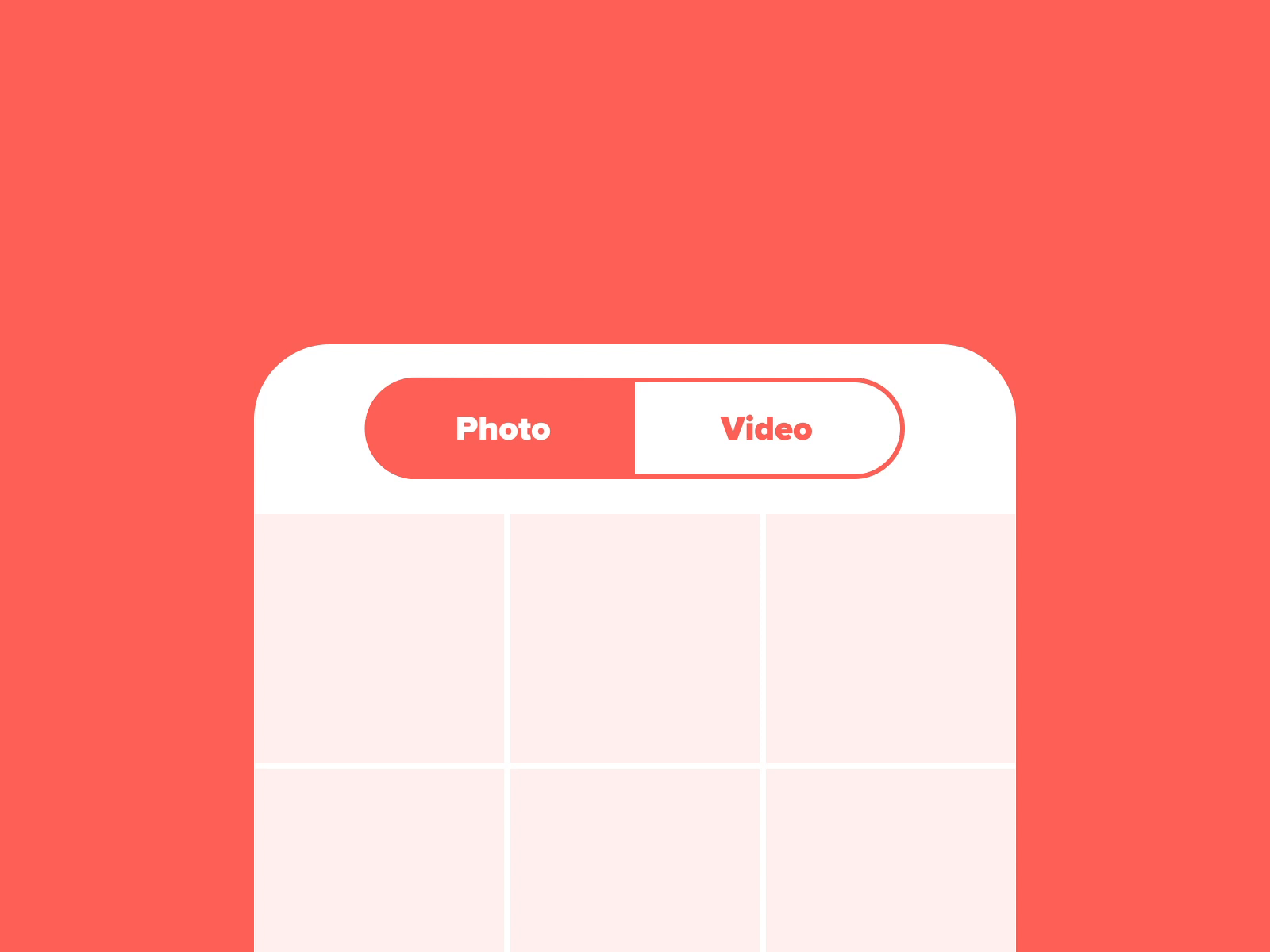
In this new post, I’m going to explain how to create a segment control for Blazor Web Assembly and Blazor Server. First of all, what is a segment control? A segmented control is a horizontal control made with multiple segments. Generally, we use segmented controls whenever we want to show a group of controls into separate sections. Born in iOS, a segment control looks like the following image:

The full source code of this Blazor component is available on GitHub.
If you are looking for more examples of components, here some more links:
- Using Chart.Js With Blazor
- Create An Accordion Component With Blazor
- Create a Blazor component for Quill
A new control
First, I have to create a new project for a new control as I did previously for other components. So, create a new project searching for Razor and select Razor Class Library.

Now, the segment component has 2 Razor pages:
- the segment container
- the definition of a segment
So, start with the implementation.
Definition of a segment
First thing first. This is a simple page and its name is Segment.razor. In this page I check if there is a Parent for it. If it is not a parent, I raise an error because a segment can’t exist without a segment container. As a Parameter the component receives the content for this segment in the RenderFragment ChildContent. For each segment, I have 2 more parameters:
- Text is the label you want to show to the user
- Value is the real value you want to use
Then, the OnInitialized() checks if there is a parent and add this segment to the list present in the segment container. If this segment is the active one, the component shows the content.
So, all of this in this code for the Segment.razor is the following
@if (Parent.ActivePage == this)
{
    @ChildContent
}

@code {
    [CascadingParameter]
    private Segments Parent { get; set; }

    [Parameter]
    public RenderFragment ChildContent { get; set; }

    [Parameter]
    public string Text { get; set; }

    [Parameter]
    public string Value { get; set; }

    protected override void OnInitialized()
    {
        if (Parent == null)
            throw new ArgumentNullException(nameof(Parent),
                   "Segment must exist within a Segments container");

        base.OnInitialized();
        Parent.AddPage(this);
    }
}
Segment control
Now, the important part. So, I’m going to split in 2 parts this page: the pseudo-HTML with CSS and the code to better understand how it is working. This code is responsible to display the segment in the page.
Segment page
Then, the first part of the Razor page is the following:
<CascadingValue Value="this">
    <div class="segment-control">
        <ul class="segments">
            @foreach (Segment tabPage in Pages)
            {
                <li class="@GetButtonClass(tabPage)"
                    @onclick=@( () => ActivatePage(tabPage) )>
                    @tabPage.Text
                </li>
            }
        </ul>
    </div>
    @ChildContent
</CascadingValue>
and the code part is this one
@code {
    [Parameter]
    public RenderFragment ChildContent { get; set; }

    [Parameter]
    public EventCallback<Segment> OnSegmentChanged { get; set; }

    public Segment ActivePage { get; set; }
    List<Segment> Pages = new List<Segment>();

    internal void AddPage(Segment tabPage)
    {
        Pages.Add(tabPage);
        if (Pages.Count == 1)
            ActivePage = tabPage;
        StateHasChanged();
    }

    string GetButtonClass(Segment page)
    {
        return page == ActivePage ? "selected" : "";
    }

    async Task ActivatePage(Segment page)
    {
        ActivePage = page;
        await OnSegmentChanged.InvokeAsync(page);
    }
}
Cascading values and parameters are a way to pass a value from a component to all of its descendants without having to use traditional component parameters.
Blazor comes with a special component called CascadingValue. This component allows whatever value is passed to it to be cascaded down its component tree to all of its descendants. The descendant components can then choose to collect the value by declaring a property of the same type, decorated with the [CascadingParameter] attribute.
So, every new segment is added in the list Pages. When a user click on a segment, the function ActivatePage changes the ActivePage and the event OnSegmentChanged is raised. With that in the page where you use the component, you are able to receive the event and run the code you want.
HTML and CSS structure
Now, you can see the segment container has a div with class segment-control. In it a ul with class segments. When a li is active, the class is selected. This is the CSS for the segment control in blue.
.segment-control {
    padding: 2px;
    width: 100%;
    border: 1px solid #003250;
    border-radius: 3px;
}

.segments {
    display: -webkit-box;
    -webkit-box-orient: horizontal;
    -webkit-box-pack: justify;
    -webkit-box-sizing: border-box;
    padding-left: 0px;
    margin-bottom: 0px;
}

.segments ul {
    margin-top: 0px;
    margin-bottom: 0px;
}

    .segments > li {
        cursor: pointer;
        margin: 2px;
        display: block;
        text-align: center;
        background-color: #ffffff;
        border-color: #003250;
        border-radius: 3px;
        color: #003250;
        font-size: 12px;
        padding: 2px;
        -webkit-box-flex: 1;
        -webkit-border-top-left-radius: 3px;
        -webkit-border-bottom-left-radius: 3px;
        -webkit-border-top-right-radius: 3px;
        -webkit-border-bottom-right-radius: 3px;
    }

        .segments > li.selected {
            background-color: #003250;
            color: #fff;
        }
So, out of the box, the segment component has 4 themes that you can use or write your custom theme.
How to use it
First, add the NuGet package in your project. The name of the package is PSC.Blazor.Components.Segments and the only dependency it has is Microsoft.AspNetCore.Components.Web (>= 5.0.10).
After that, in your wwwroot\index.html or in the hosts file, you have to add a theme (CSS) for your segment control. Obviously, you can create your own theme. So, use this code:
<link href="_content/PSC.Blazor.Components.Segments/themes/{theme-name}.css" rel="stylesheet" />
Out of the box, there are 4 themes (see below the images):
- Blue (theme name: blue)
- Green (theme name: green)
- Red (theme name: red)
- Light color (theme name: lightcolors)
Then, in your _Imports.razor add this
@using PSC.Blazor.Components.Segments
Now, you are ready to use your segment control.
Example
As a user, I want to select a country from a list of countries. When I click on one of them, other data has to change accordingly.
So, in a page add the following code:
<Segments OnSegmentChanged="OnSegmentChanged">
    <Segment Text="Global" Value="global"></Segment>
    <Segment Text="Australia" Value="australia"></Segment>
    <Segment Text="Brazil" Value="brazil"></Segment>
    <Segment Text="Canada" Value="canada"></Segment>
    <Segment Text="France" Value="france"></Segment>
    <Segment Text="Germany" Value="germany"></Segment>
    <Segment Text="Italy" Value="italy"></Segment>
    <Segment Text="Spain" Value="spain"></Segment>
    <Segment Text="UK" Value="uk"></Segment>
</Segments>
Each Segment has 2 properties:
- Text: the label you want to show to the user
- Value: the real value you want to use
So, the Segments has the property OnSegmentChanged that it is invoked every time a user click on a segment. So, define the function in your page the segment has to invoke like that
public async Task OnSegmentChanged(Segment segment)
{
    // code to run
}
Themes
Now, there are 4 themes embedded in the segment control.


Wrap up
So, now we have a segment control for our Blazor applications. If you have any questions or comments, leave you message at the bottom of this post or use the Forum.