In this new post, I introduce to you the new ScrollTabs component for Blazor WebAssembly and Blazor Server. This is quite a nice component for showing a lot of tabs. This is a new implementation of my other component Tabs control for Blazor.

The source code of this component is available on GitHub.
Scenario
So, think about the following UI problem. In a page of your application, you want to display few tabs. To create them, you use Bootstrap. For example, you can add tabs with this code
<ul class="nav nav-tabs" id="myTab" role="tablist">
  <li class="nav-item">
    <a class="nav-link active" id="home-tab" data-toggle="tab" href="#home" role="tab" aria-controls="home" aria-selected="true">Home</a>
  </li>
  <li class="nav-item">
    <a class="nav-link" id="profile-tab" data-toggle="tab" href="#profile" role="tab" aria-controls="profile" aria-selected="false">Profile</a>
  </li>
  <li class="nav-item">
    <a class="nav-link" id="contact-tab" data-toggle="tab" href="#contact" role="tab" aria-controls="contact" aria-selected="false">Contact</a>
  </li>
</ul>
<div class="tab-content" id="myTabContent">
  <div class="tab-pane fade show active" id="home" role="tabpanel" aria-labelledby="home-tab">...</div>
  <div class="tab-pane fade" id="profile" role="tabpanel" aria-labelledby="profile-tab">...</div>
  <div class="tab-pane fade" id="contact" role="tabpanel" aria-labelledby="contact-tab">...</div>
</div>
And the result is exactly what you think now.
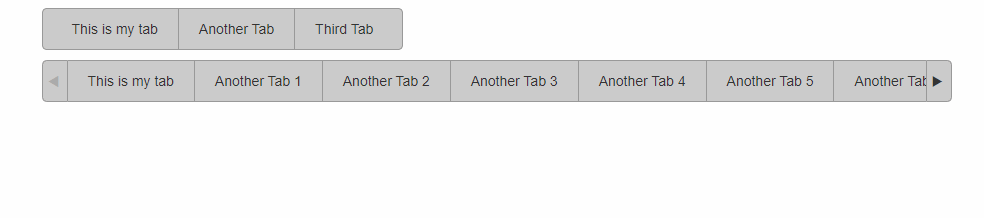
This is perfectly fine if the title in each tab is short, and the tabs are visible in the mobile version of the website. However, if your tabs don’t have a short title and there are a lot of them, the mobile version is very painful and difficult to manage. How to display nicely the tabs?
ScrollTabs is the answer
For this reason, I created this ScrollTabs component for Blazor: you have a flexible component to display a lot of tabs without using a scroll bar that it is ugly but 2 simple arrows on both ends of the bar.
How to add the ScrollTabs to your project
First, if your project is a Blazor WebAssembly, open the index.html and add the following lines in the header of the page
<link href="_content/PSC.Blazor.Components.ScrollTabs/css/scrolltabs.css" rel="stylesheet" />
Then, before the BODY tag closed, add the following lines:
<script src="_content/PSC.Blazor.Components.ScrollTabs/js/jquery.mousewheel.js"></script>
<script src="_content/PSC.Blazor.Components.ScrollTabs/js/jquery.scrolltabs.js"></script>

<script src="_content/PSC.Blazor.Components.ScrollTabs/js/scrolltabs.js"></script>
An important thing to remember is that this component requires jQuery and Bootstrap. You can install those libraries in your project from Visual Studio > Client-side library.
Finally, in the _Imports.razor add
@using PSC.Blazor.Components.ScrollTabs
Use the ScrollTabs
In your Razor page, you can call the component like that
<ScrollTabs TabId="TabId1" OnTabChanged="OnTabChanged" Theme="Theme.Dark">
    <Tab Text="Tab 1" Value="Tab1">
        <h2>Content Tab 1</h2>
        <p>
            This is the content for the Tab 1. It is enabled.
        </p>
    </Tab>
    <Tab Text="Tab 2" Value="Tab2">
        <h2>Content Tab 2</h2>
        <p>
            This is the content for the Tab 2. It is enabled.
        </p>
    </Tab>
</ScrollTabs>
@code {
    public async Task OnTabChanged(Tab tab)
    {
        Console.WriteLine($"Tab value: {tab.Value} - Tab text: {tab.Text}");
    }
}
Themes
Embedded in the components, there are 3 theme options:
- Light
- Dark
- None
You can use None to use your custom implementation.
Add your style
Very often, you have to add your style and then you have to create the CSS for it. The component has the property CSSClass: with this property you can set your CSS following this code:
/* Set the content of the arrows to nothing, we will use a background image of our own. */
.style1 .scroll_tab_left_button::before {
	content: "";
	padding: 0px;
}

.style1 .scroll_tab_right_button::before {
	content: "";
	padding: 0px;
}

/* Set up our background image (i.e. toolbar for example) behind the tab-set */
.style1 div.scroll_tab_inner {
	height: 40px;
	background: url(../images/toolbar-bg.jpg) repeat-x;
}

	/* Setup the appearance of each individual TAB */
	.style1 div.scroll_tab_inner span {
		padding-left: 20px;
		padding-right: 20px;
		line-height: 40px;
		font-size: 14px;
		background: transparent url(../images/scroll_tab_bg.jpg) no-repeat -25px -40px;
		color: #FFFFFF;
		cursor: pointer;
	}

		/* Style the FIRST tab differently from the rest, inherits from above */
		.style1 div.scroll_tab_inner span.scroll_tab_first {
			background: transparent url(../images/scroll_tab_bg.jpg) no-repeat -40px -40px;
		}

		/* Style the hover state for each tab */
		.style1 div.scroll_tab_inner span.scroll_tab_over {
			background: transparent url(../images/scroll_tab_bg.jpg) no-repeat -25px 0px !important;
		}

		/* Style the hover state for the first tab (Using MULTI-CLASS selectors may not work right in older browsers) */
		.style1 div.scroll_tab_inner span.scroll_tab_first.scroll_tab_over {
			background: transparent url(../images/scroll_tab_bg.jpg) no-repeat -40px 0px !important;
		}

		/* Style the left of the tab set if the arrows are hidden (the are is wide enough to show ALL the tabs */
		.style1 div.scroll_tab_inner span.scroll_tab_left_finisher {
			padding: 0px;
			width: 10px;
			background: transparent url(../images/scroll_tab_bg.jpg) no-repeat 0px -160px;
		}

			/* AND HOVER STATE */
			.style1 div.scroll_tab_inner span.scroll_tab_left_finisher.scroll_tab_over {
				background-position: 0px -120px !important;
			}

			/* AND SELECTED STATE */
			.style1 div.scroll_tab_inner span.scroll_tab_left_finisher.tab_selected {
				background-position: 0px -200px;
			}

		/* Style the right of the tab set if the arrows are hidden (the are is wide enough to show ALL the tabs */
		.style1 div.scroll_tab_inner span.scroll_tab_right_finisher {
			padding: 0px;
			width: 10px;
			background: transparent url(../images/scroll_tab_bg.jpg) no-repeat right -160px;
		}

/* AND HOVER STATE */
.style1div.scroll_tab_inner span.scroll_tab_right_finisher.scroll_tab_over {
	background-position: right -120px !important;
}

/* AND SELECTED STATE */
.style1div.scroll_tab_inner span.scroll_tab_right_finisher.tab_selected {
	background-position: right -200px;
}

/* Style left scrolling button */
.style1 .scroll_tab_left_button {
	height: 40px;
	background: transparent url(../images/scroll_tab_bg.jpg) no-repeat 0px -40px;
}

	/* Style left scrolling button HOVER */
	.style1 .scroll_tab_left_button.scroll_arrow_over {
		background: transparent url(../images/scroll_tab_bg.jpg) no-repeat 0px 0px;
	}

	/* Style left scrolling button DISABLED */
	.style1 .scroll_tab_left_button.scroll_arrow_disabled {
		background: transparent url(../images/scroll_tab_bg.jpg) no-repeat 0px -80px;
	}

/* Style right scrolling button */
.style1 .scroll_tab_right_button {
	height: 40px;
	background: transparent url(../images/scroll_tab_bg.jpg) no-repeat -474px -40px;
}

	/* Style right scrolling button HOVER */
	.style1 .scroll_tab_right_button.scroll_arrow_over {
		background: transparent url(../images/scroll_tab_bg.jpg) no-repeat -474px 0px;
	}

	/* Style right scrolling button DISABLED */
	.style1 .scroll_tab_right_button.scroll_arrow_disabled {
		background: transparent url(../images/scroll_tab_bg.jpg) no-repeat -474px -80px;
	}

/* Style SELECTED (depressed) tab */
.style1 div.scroll_tab_inner span.tab_selected {
	background: transparent url(../images/scroll_tab_bg.jpg) no-repeat -25px -80px;
}

	/* Style SELECTED (depressed) if it's the FIRST tab */
	.style1 div.scroll_tab_inner span.tab_selected.scroll_tab_first {
		background-position: -40px -200px;
	}
Wrap up
In conclusion, I hope that the ScrollTabs component for Blazor will be useful in your project. If you have any questions or comment, please write it in the Forum.